Design project: Coffee Shop in Green Bay
Green Bay, Wisconsin is not known for its coffee culture, but it does have a rich history of Belgian immigration. The Belgian Pastry Cafe was created to bring these two elements together.
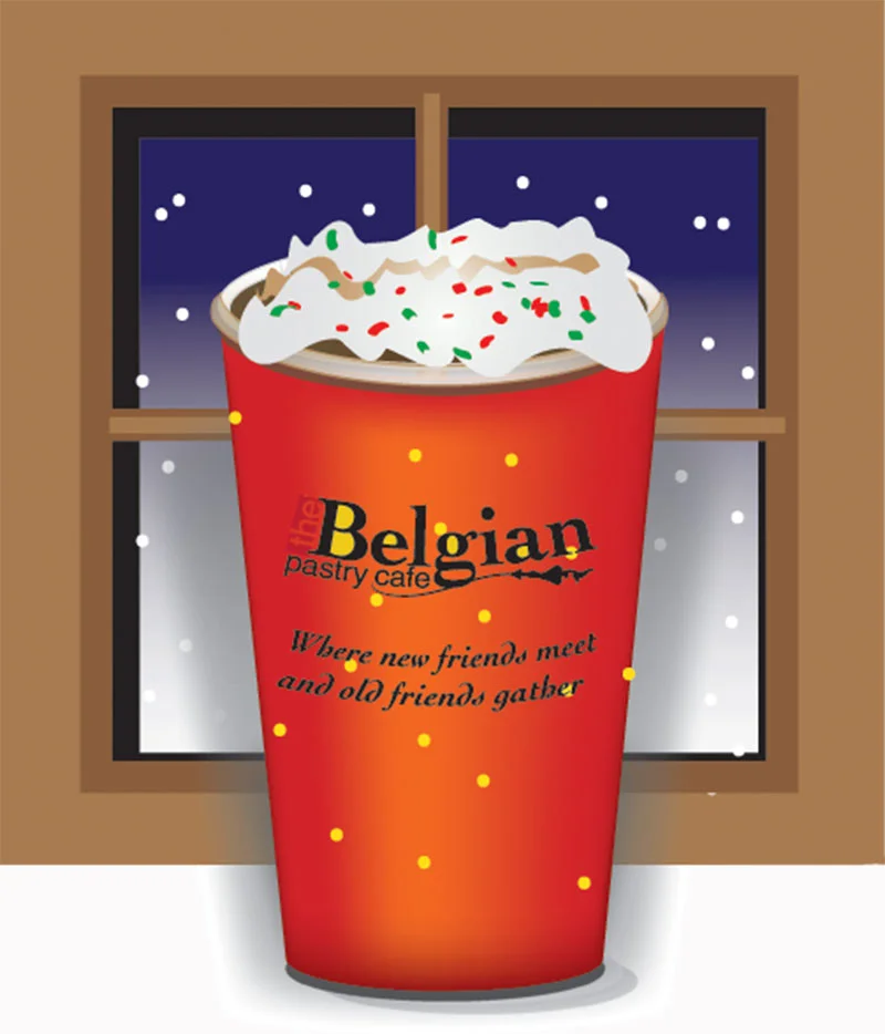
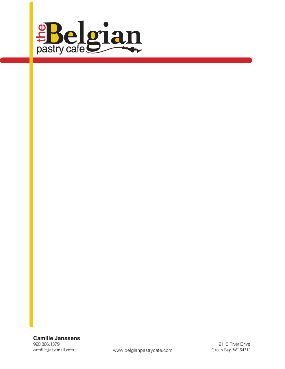
Marketing products: Logo Design, Marketing promo design, Menu, Business Card, Promotional Ad, Take-out bag, and stationary.
Menu project includes food design and photography, Adobe Illustrator artwork, menu layout using Adobe InDesign..
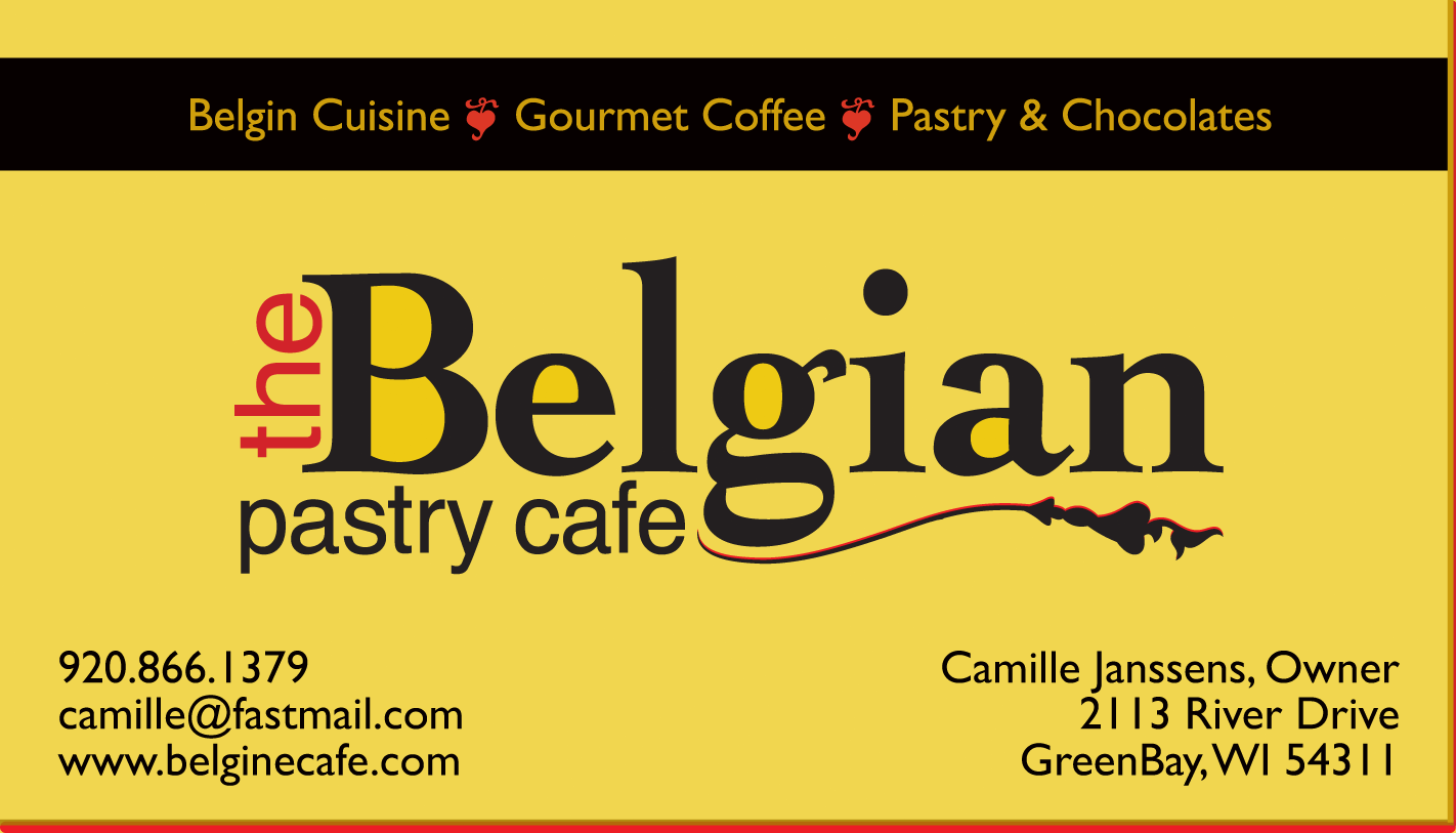
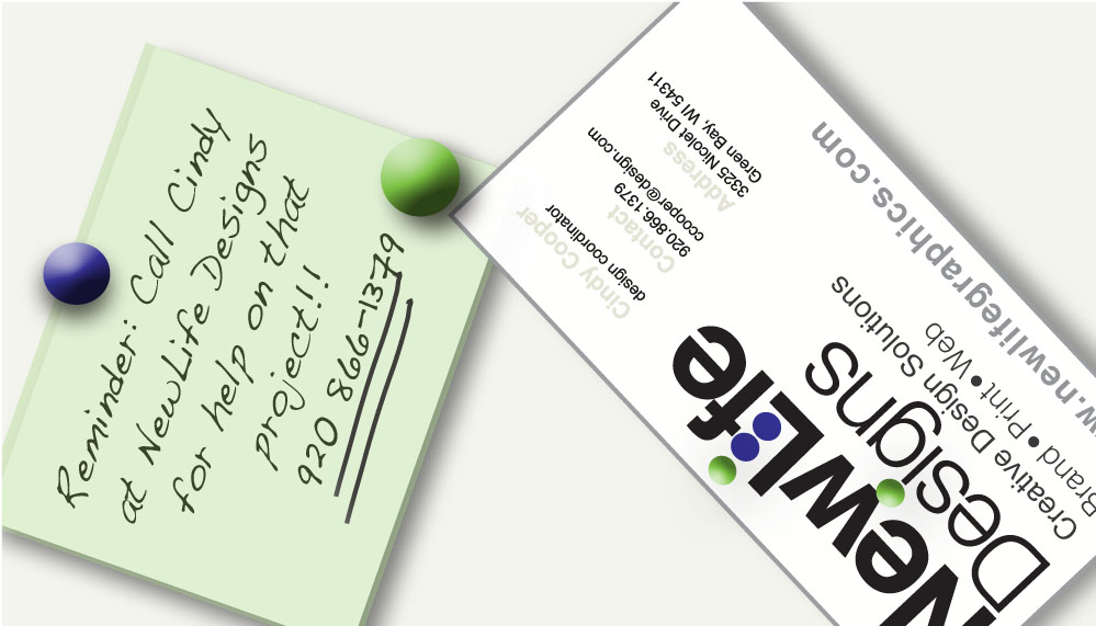
Business card designed to promote specialty gourmet Belgian offerings while also promoting a warm and friendly atmosphere.
Design created in Adobe illustrator.
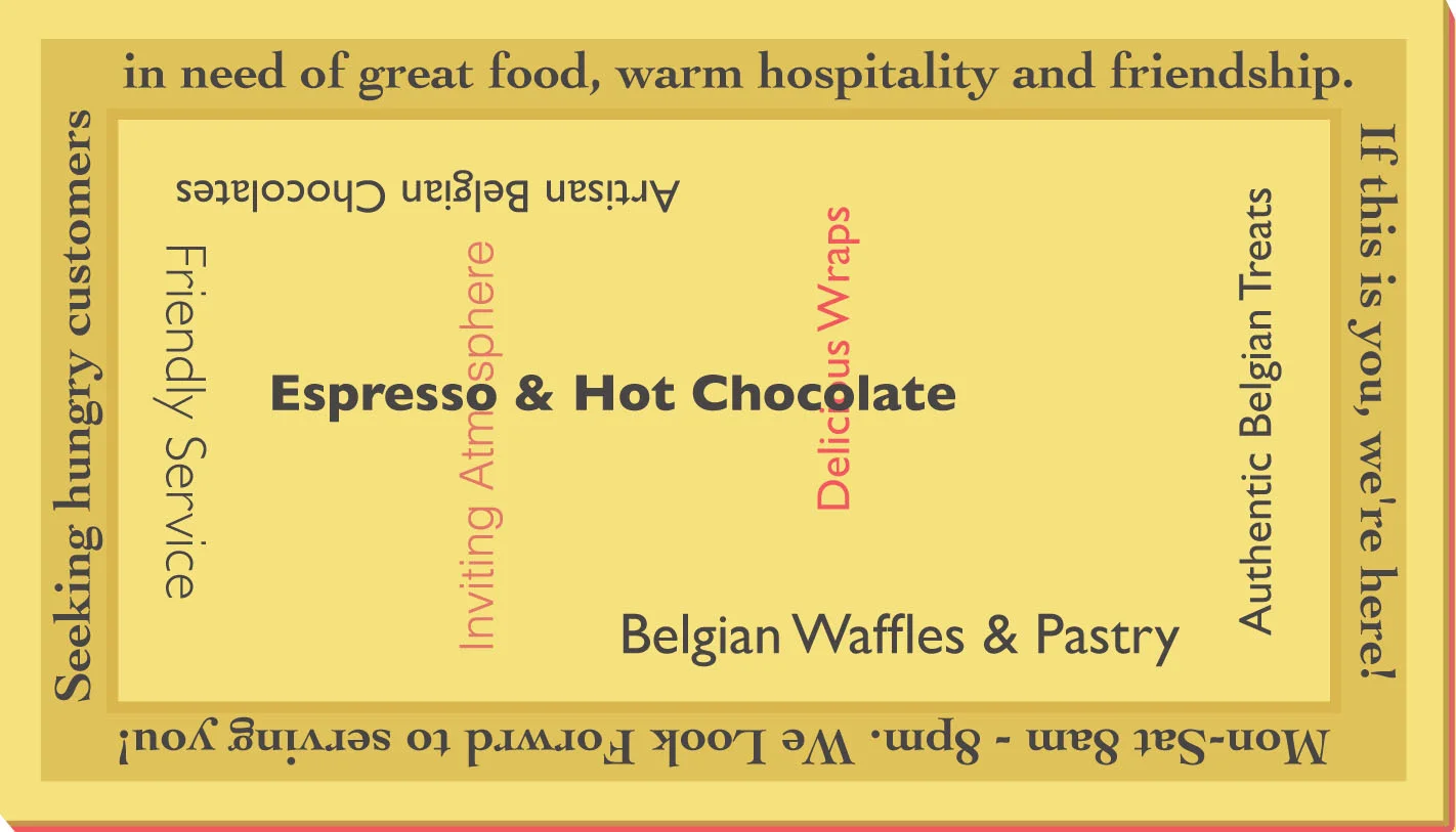
The back of this card serves as a friendly call to action with it's peg board note design.
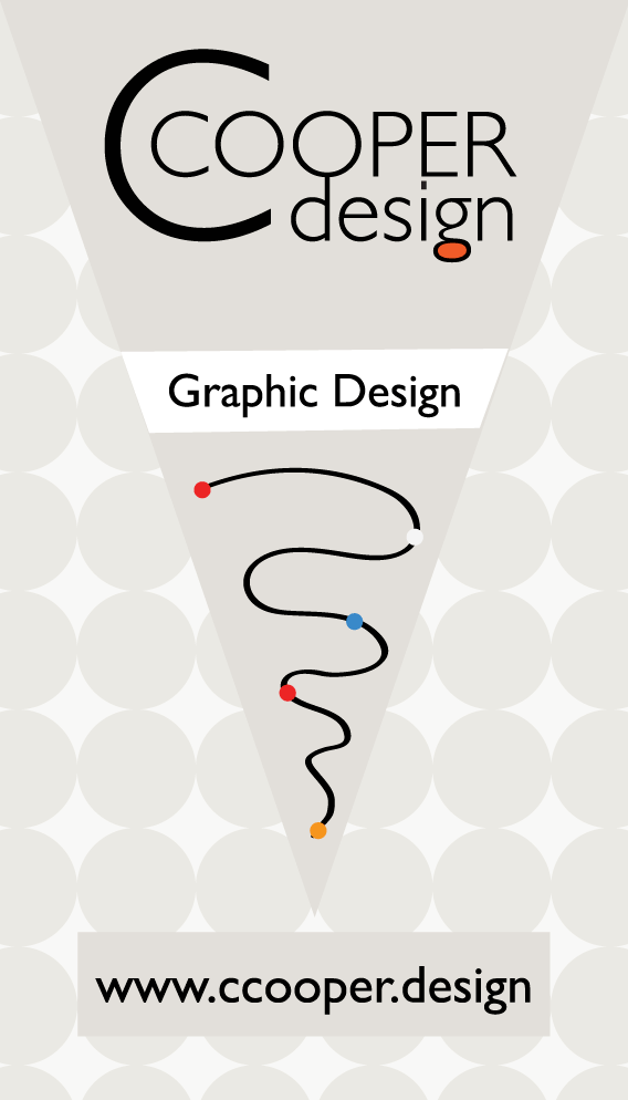
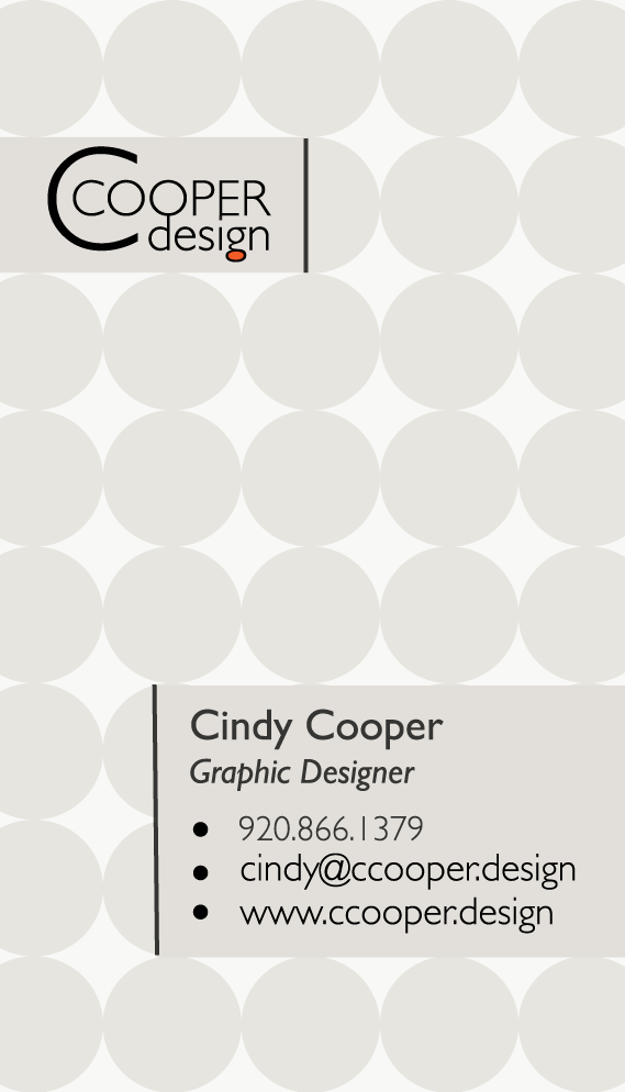
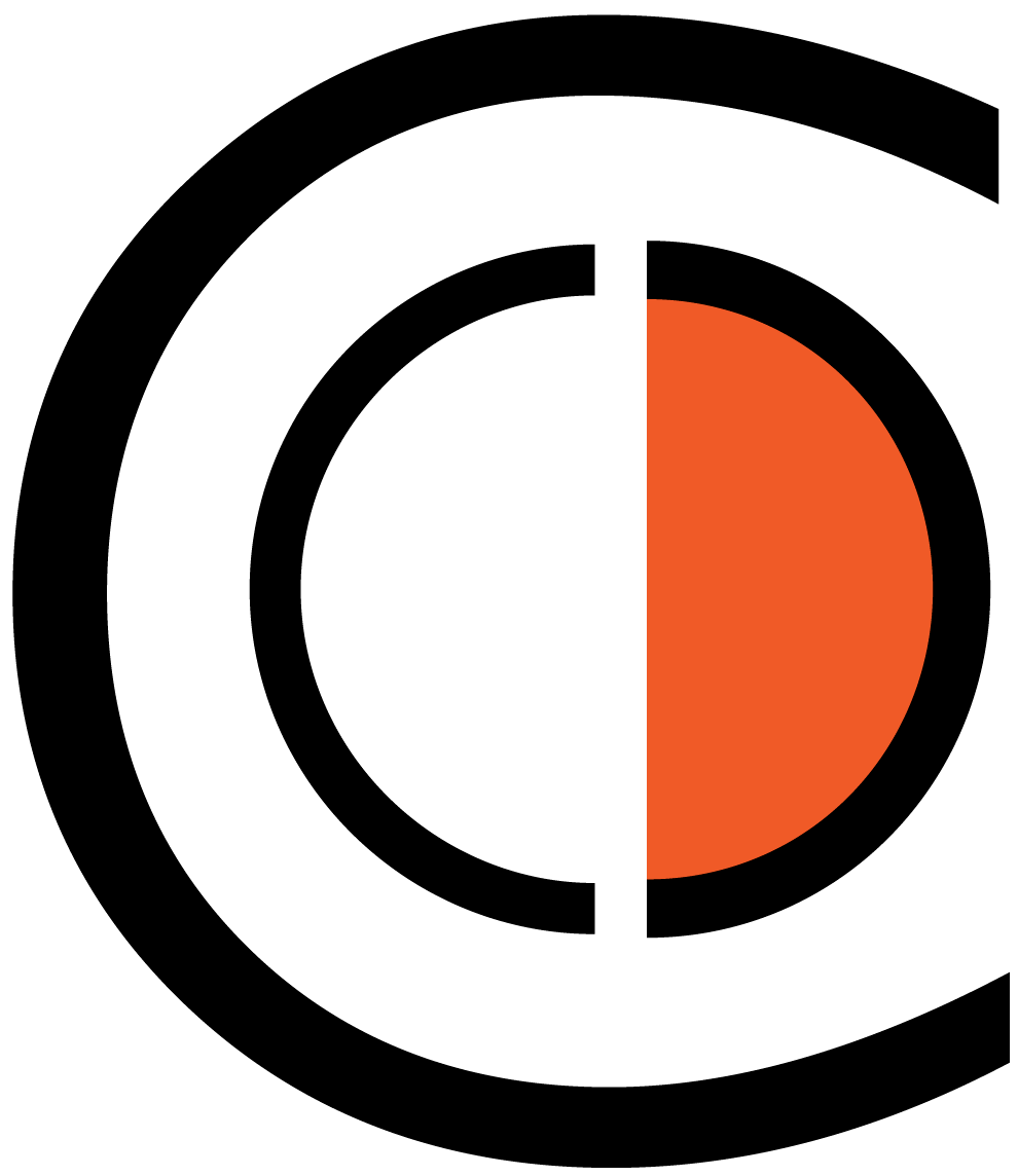
This logo emphasizes the double "c" in the domain name "ccooper.design". The orange fill in the letter "g" adds just enough color without dominating the logo design. Overall, the design is cheerful, energetic and creative - just like the designer herself!
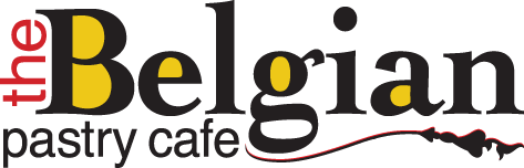
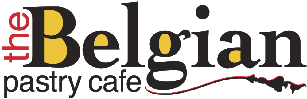
This logo uses the colors of the Belgian flag (red, black, and yellow) along with Swiss and Belgian design elements to produce a logo that is modern and bold while maintaining a bit of traditional old world charm.
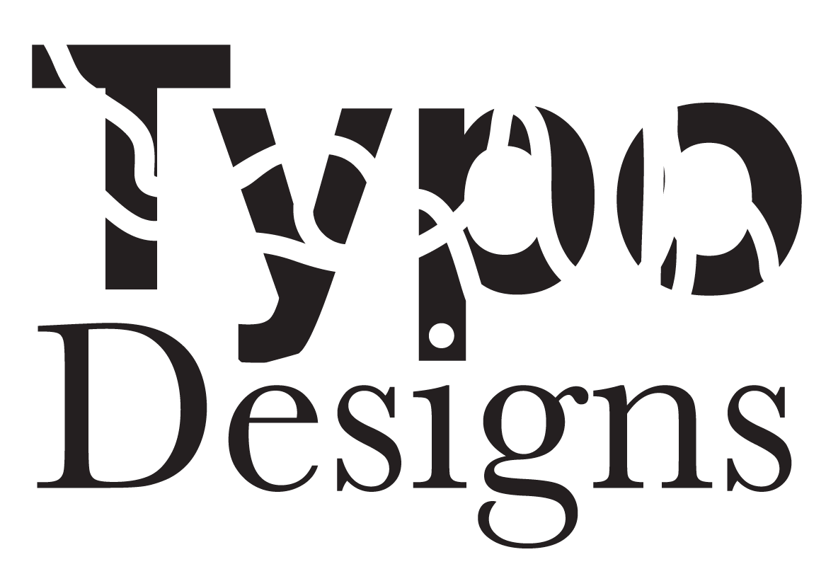
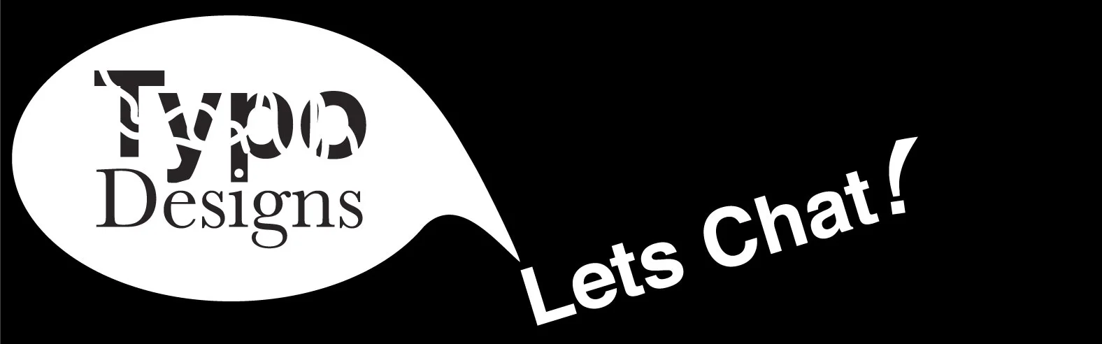
Typo designs is a play on the word "typography." And, while "typo's" should never occur in professional work, the name and the design demonstrate the creative intelligence and whim of the designer.
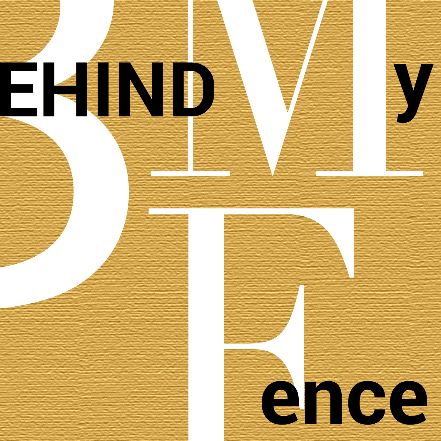
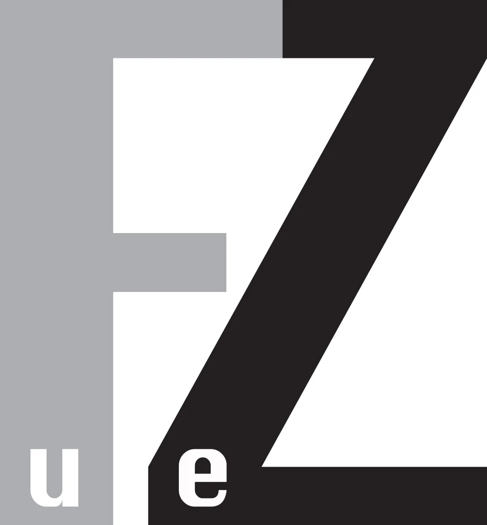
As a subtle reference to the wedge my fence drove between me and my neighbors, the letter F forms a wedge between the letters "e" and "n" in "Fence." The world of typography is fascinating and complex providing endless possibilities for the expression of ideas and artistic expression when letterforms become design elements.
This favicon mirrors the design elements in the logo for "ccooper. design," representing the double "C", while also adding the color spot to a capital "D" to emphasize "Design." As a favicon, it is unique and easily recognized in the browser.
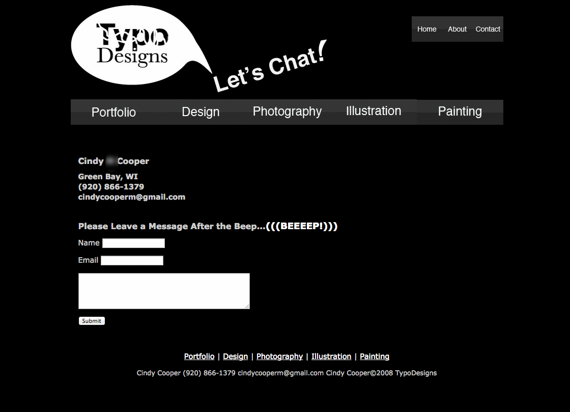
The header design incorporates the site logo with several friendly messages: "Welcome!" (home page), "Projects" (Design Projects), "Let's Chat" (Contact Page), and, "Why I Design" (About Page).
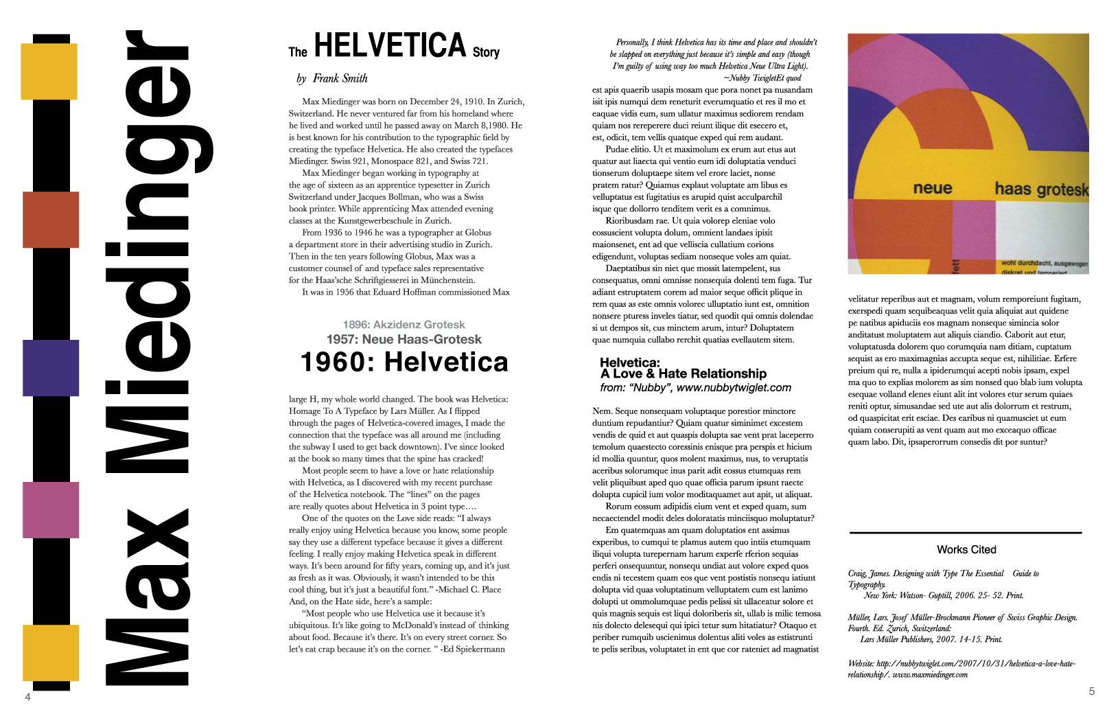
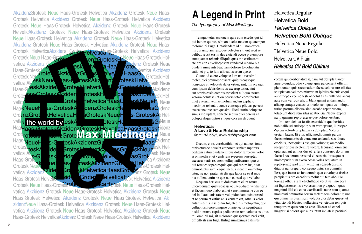
The concept for this page design was to demonstrate how this sans-serif typeface has dominated the world of typography. Created in 1957 by Max Miedinger, Helvetica continues to be a solid performer for clean, bold typographic design.
Layered paper collage, abstract paintings with acrylic and rice paper, charcoal drawings, digital artworks.
Painting: Water Color, dimensional collage on paper
24" X 16"
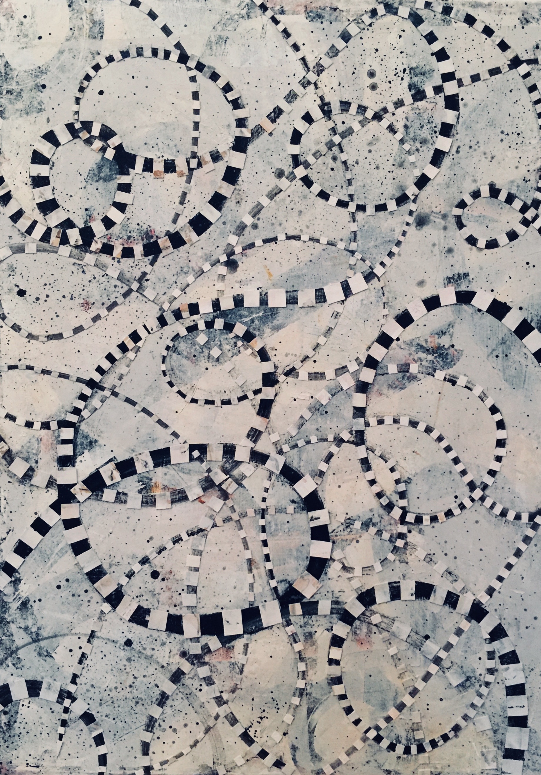
Diptych: Acrylic, paper collage on canvas
20" X 16"
Diptych: Acrylic, paper collage on canvas
20" X 16"
Gouache on paper, layered paper cutouts in shadow box frame.
14 X 12"
Charcoal sketch on newsprint
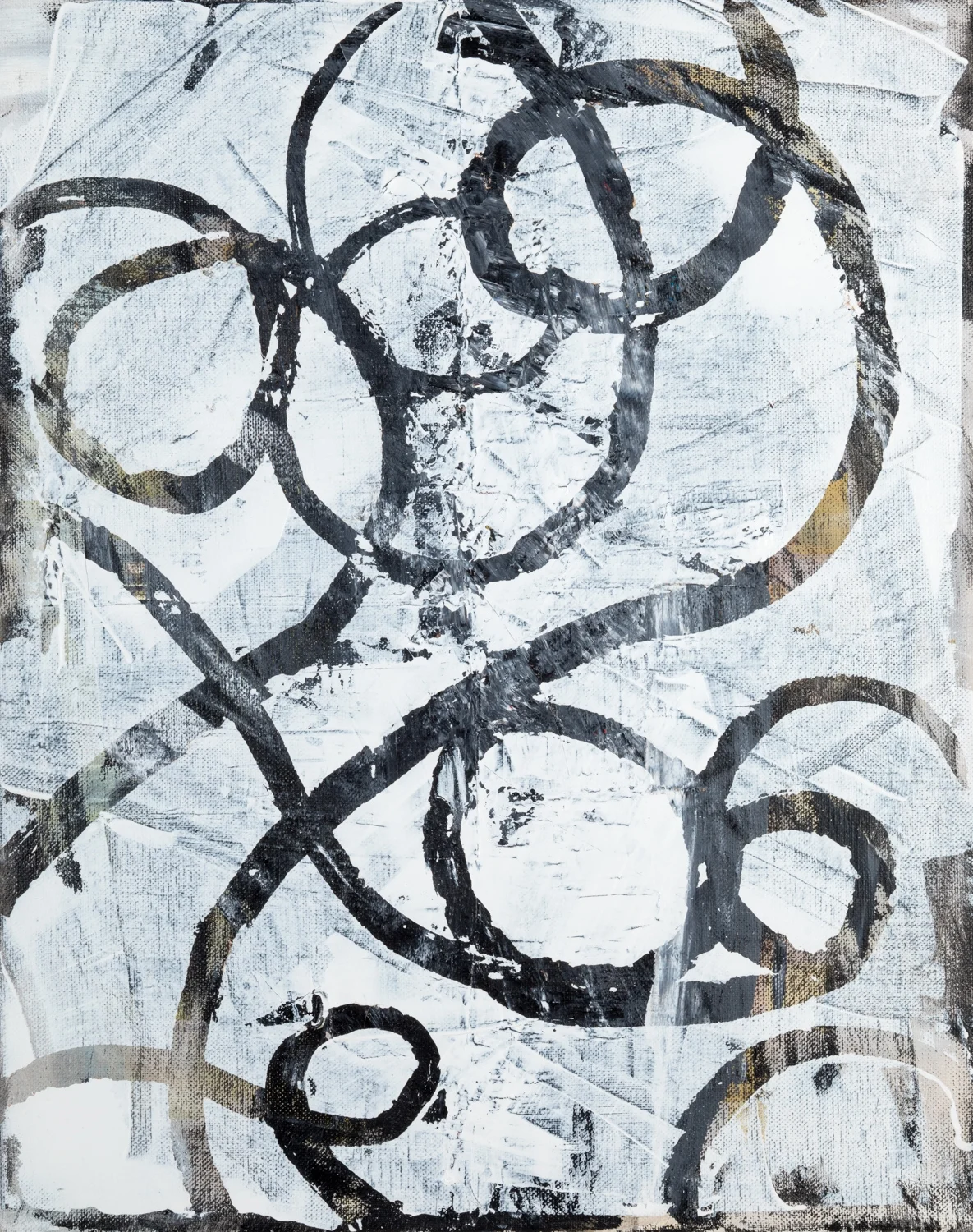
Acrylic on canvas
20" X 16"
Acrylic on Canvas
12" x12"
Acrylic on canvas
12" X 12"
Acrylic on Canvas 16” x 8”
2017
Acrylic on canvas
20" X 16"
Acrylic, pastel on paper
32" X 24"
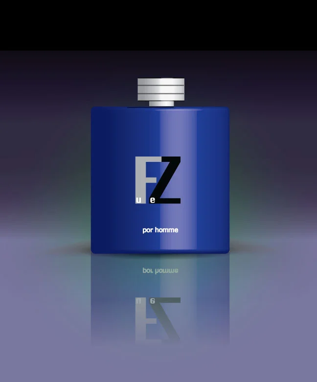
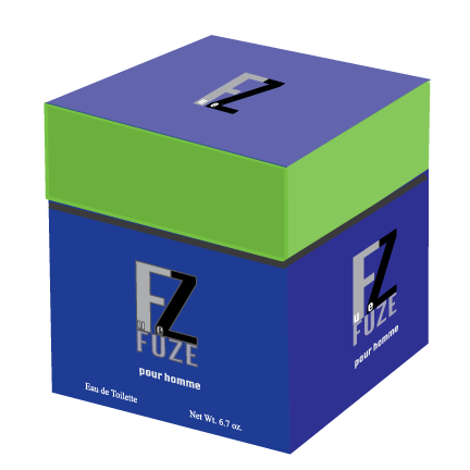
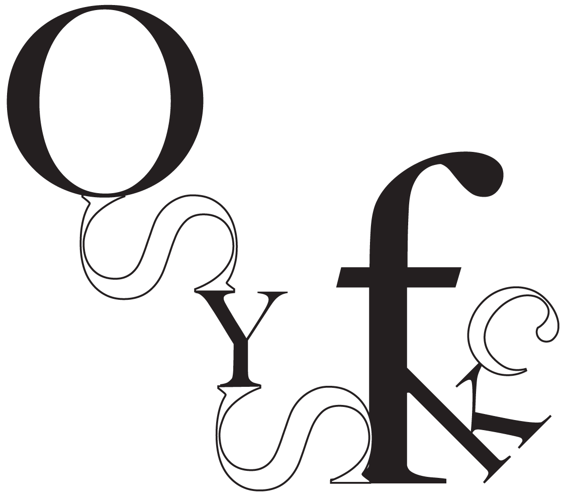
Illustrator Letterform Design Project
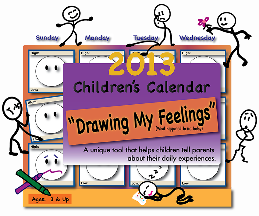
Designed to highlight the high's and low's of a child's day, week, and month, this calendar is also a useful tool to chart events which may be significant to a child's safety and well being. At the same time, the calendar offers children a creative and fun way to express their day to day emotions and experiences. Ultimately, the calendar is a great way for parents to spend quality time with their child.
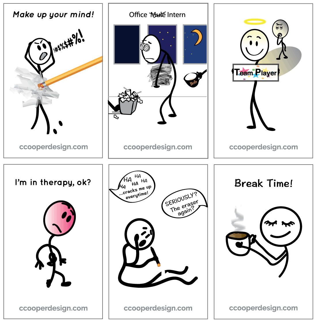
Office note cards to share with co-workers and friends.
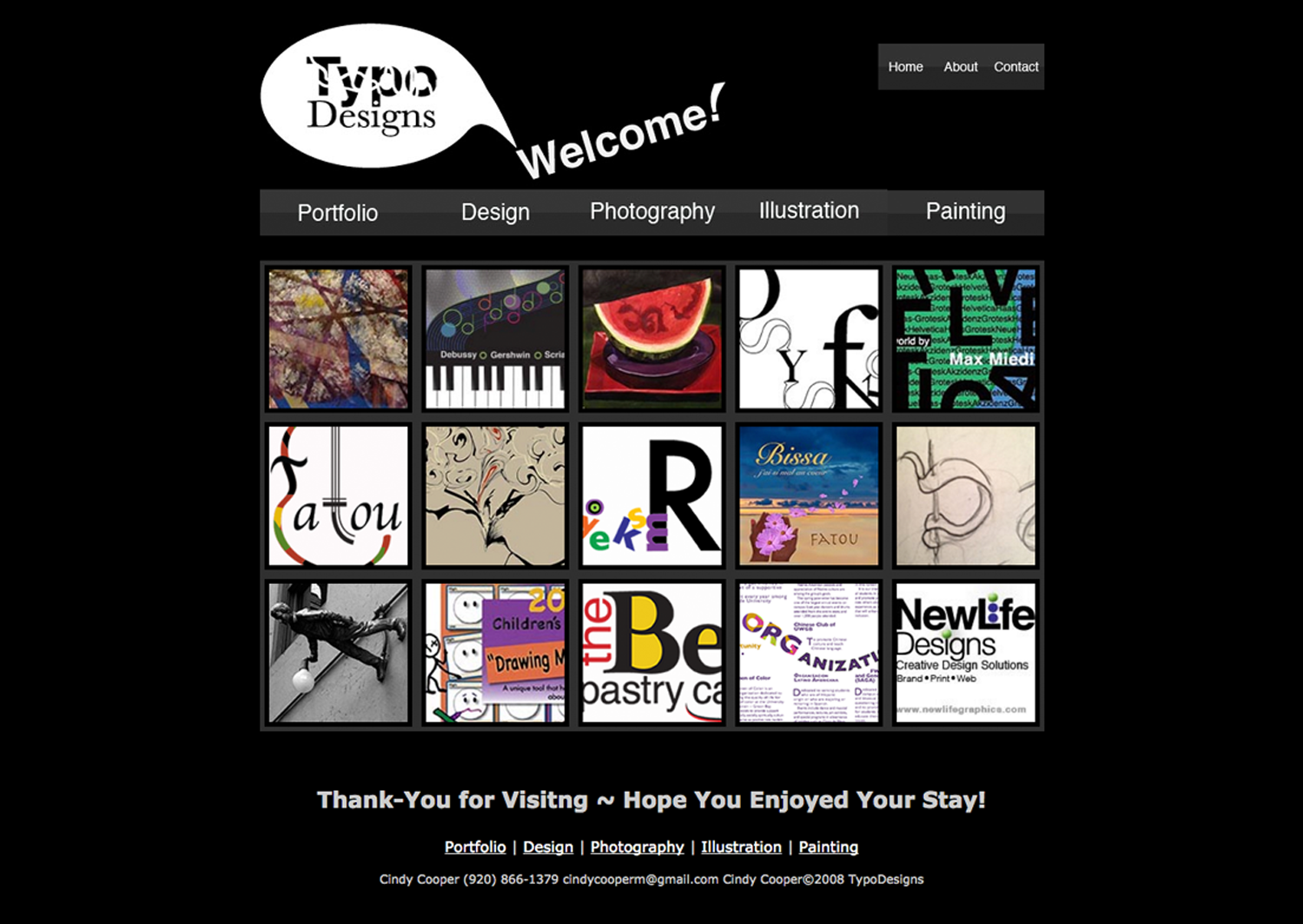
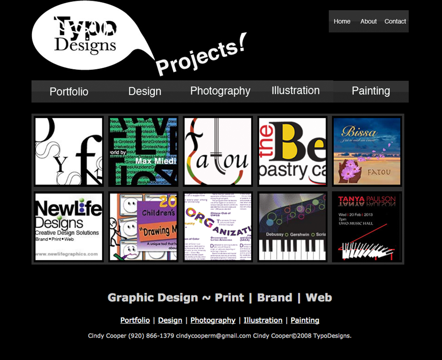
Adobe Dream Weaver portfolio website for a graphic designer.
The site draws attention through its colorful and uplifting design. Page headers promote the designer's positive and creative energy and the site is designed for easy navigation. The black background and white type provides strong readability.
Users navigate the site through navigation bars on the top and bottom of each page or by clicking on individual portfolio thumbnail images, which take the user to side scrolling content. Navigation bar buttons change color when selected.